How designs can stand out with this simple tweak.

pexels-jeff-denlea-5712598
In design, there are many moving parts to be aware of, and among the most important of these is perspective. We’ll cover how to have perspective in design, and using it whether we’re a professional in the field or just as a casual user.
Perspective is everything.
When you look at something in your room right now, there are objects that are closer to your field of vision and objects that are farther away.
For us to judge the distance of those objects, color is a distinct part of awareness.
This helps us know how far we need to walk, or simply wheel our chair around to get something.
In fact, the good ol’ dictionary states that perspective is,
“the art of drawing solid objects on a [two-dimensional] surface so as to give the right impression of their height, width, depth, and position in relation to each other when viewed from a particular point.”
A simpler way to say this is to see the 3D position of an object, and I’ll add, in relation to other objects.
An object’s relation to other objects is important, because when designing in a software like Adobe Illustrator, the shapes we create can’t just look meshed together.
Instead, shapes create complicated forms that share a relationship with other objects like text, to either describe that object or enhance it.
This can be done in many ways, and I’ll give some clip art examples for starters:

taken from google images of adobe stock
As shown from the seeing the objects that make up these cute penguins, perspective gives an object a position in relation to other objects.
Now, how does color influence this?
Gradients make the world go round
In anything you see IRL, there are tones that either darken or lighten (tint) an object. We’ll call these color shifts, because when it comes to design, there’s a few different types to use.
Here, we’ll name the most common:
Weak and strong gradation.
(Note: I looked all over for the right terminology, another use for this would be a Proportional & Nonproportional color inventory)
Having a weak gradation means that there are a countable number of unmodulated colors.
Like the cartoon examples you saw, these colors have no flow or gradient between colors, they’re flat on the surface.
A strong gradation has an innumerable amount of colors, giving an object a sense of flow and realism, otherwise known as a gradient.
Both strong and weak gradation give a sense of visual depth, especially on the screen.
And here’s how that’s done.
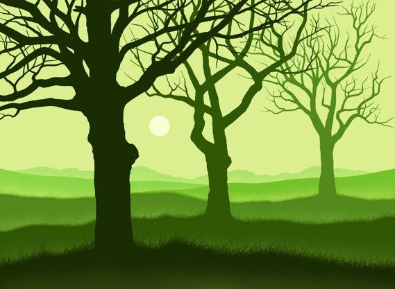
image taken from website
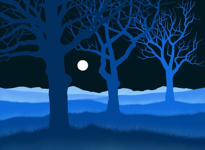
image taken from website
When you look at each of these landscape images, you may notice that as parts of the landscape become farther from the eye, the more its colors and tones change.
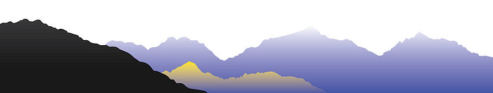
This is “due to the nature of the atmosphere,” and is given a name, Aerial perspective.
Leonardo Da Vinci observed this, and took careful note for his paintings by breaking down Aerial Perspective into 3 steps:
1. How the size of objects diminish with distance
2. Colors change the farther away
3. Objects have less detail the further they are
All of these can be considered depending on the point of view that someone has, or the POV displayed in a painting (or design, in our case).
And this can be done in any medium, by gradually changing the tones between the foreground and the background “to create the impression of space.”
This effect can also be done in stark color differences if you’re constructing a cartoon (or the clip art noted earlier), for example, if you’re wanting a weak gradation effect.
This website gives some great examples, I would recommend using the sliders on image 3 & 4 to see the difference this makes!
What’s interesting about aerial perspective too, is that it’s a result of atmospheric haze, now what does this mean?
Using colors, a setting’s mood is created. Consider the difference in the two images you used the sliders for.
What do each of these make you feel?
To me, the bright green gradating with dark green made me feel like there was danger, like maybe they were evil woods and due to the green haze, I couldn’t see what was beyond the focus point (the trees).
The sun is also shining, and considering that we almost never see a green atmosphere naturally, the colors are unnatural and give an even deeper fear of what might be lurking.
Now let’s take the second image.
The light blue gradating with the dark blues makes it feel like night time.
I feel peaceful when looking at it, yet, also as if there’s an omnipresent air that gives the feeling that nothing is being concealed, further helping to reduce any anxiety — unlike the first image we saw.
Color makes a huge impact when it comes to establishing a mood by perspective.
Consider if these images were mainly red, yellow, or purple… how would you feel then?
Placing Shapes in Space
Now taking this into design application, we can take a look at Aerial perspective, and one we didn’t touch much on, Linear perspective.
We may be more familiar with this term, but Linear perspective is the arrangement of shapes and how it affects the appearance of distance from a given point of view.
Or simply, the “organization of shapes in space.”
We design everything with linear perspective. The workspace on Illustrator or Canva is essentially, organizing shapes in space.
But joined with Aerial perspective creates an incredible effect!
This gives the illusion of depth, even in a flat space.
As this website comments,
“Both linear and aerial perspectives combine to create this convincing illusion of three dimensions on a two dimensional plane.”
This same article shares examples at the bottom of the page for different shapes and shadows that highlight their dimensions, a great resource to use!
Recently, I took the principles of Aerial Perspective and applied them in designing covers I created for Notion.

Non-Commercial image designed by OJ
Notice how you can see a sense of depth with this cover?
Now take a look at the following gradient cover I designed, and note how the flow of colors makes it have even more depth!
Non-Commercial image designed by OJ
So the simple tweak you can use in your designs,
is to give depth to a space using color, and choosing either a weak or strong gradation to make it flow.
Not only will this be visually appealing, but will enhance the mood of whatever the purpose of your design is.
This article was inspired by my research of Aerial Perspective, and helped me to apply it in my college work & projects I was working on.
I’d love to read what ya’ll thought of this! Is there something I missed or could have said more clearly? Don’t be afraid to correct me :)